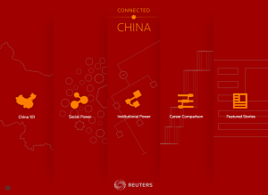
 I attended a presentation today by Irene Jay Liu, news editor for Thomson Reuters and project leader and editor for ConnectedChina. It was a great demonstration of the app, especially since there is so much to see in the app. It is difficult to understand all its potential unless you see someone using it or you spend a lot of time with it.
My favourite take away from the presentation was how Irene called it a living app because it is designed and built upon a database that is continuing to be updated. It is an impressive system that will surely influence how future projects like this are built.
I asked a question about the deep-linking and sharing from within the app. It struck me that there is potential for this kind of reuse, but that likely it is not fully being used. Irene indicated their analytics do show deep-linking. However, I find the very nature of the app, with hidden URLs (why couldn’t they use HTML5’s History API?) and built-in sharing and back buttons are doing a disservice to the potential of this impressive database.
Although Irene said that the average user spends 22 minutes on the site and the app was built to emphasize this sticky quality, I cannot help but believe it is missing a great opportunity, if they don’t find a better way to encourage deep-linking. Like I mentioned above, taking advantage of HTML5’s History API would greatly improve this. It would also enable the back button to have meaning, as well, the emphasis on exposed URLs for all the resources within the site would increase how it is shared.
Another major problem with the app is that there is no mobile version. And even worse, the experience simply fails without any indication or message about the display issues. I suspect they will fix this and eventually construct a web-based front-end. Without a mobile version, the ability to pass around addresses on services like Twitter become very complex. A person will need to save and open on another device, if they wish to follow any of the shared links.
The ConnectedChina app also includes a limited series of related news pulled into the app from Reuters. The articles nicely link into the various data within the app. I asked whether these URLs have been used outside of the app, where these original news articles appear and Irene said that Reuters is a large organization and it would be difficult to do this is any systematic way. Fair enough, but you know the trick to beginning to incorporate links elsewhere within Reuters would be to expose those links and construct the app first and foremost for sharing.
So I’m brought back to Irene’s comment about the app being designed to be sticky. I can’t help but feel like this goal, although impressive if people are spending so much time within it, is nevertheless missing a great potential by not emphasizing the social. After all, I feel like that is what I have been learning over the last few years. Information Architecture has been changing from the system like a gated community, where you search within the site using a deep information structure, to one where there are a million entry points into the information you offer. Learning how to enable this kind of open infrastructure is so important to the projects we build now. It will be great to see if ConnectedChina will adapt in this direction.
One final thought on why this is all so important: Irene mentioned that not many people know that the ConnectedChina is a living app. Certainly one way to get the word out is to promote it. But an even better way is to develop the system so that social networks and search engines begin to pick up on all the massive amounts of direct links available to your data. This way, you literally create a map (or better yet, let others create the map for you) of the information you have. And by opening it up, you encourage other sites to use those data points almost like Wikipedia. Knowing that there is a direct URL and being confident that the content at the end of that URL will persist and become updated is the best way to encourage the use of a living app.
